July Improvements Roundup
This month's update moves into the time domain. Multiviz gets velocity and envelope waveforms, autocorrelation, a circular waveform plot, a spectrum x-axis in shaft orders, and estimates more accurately the running speed for you.
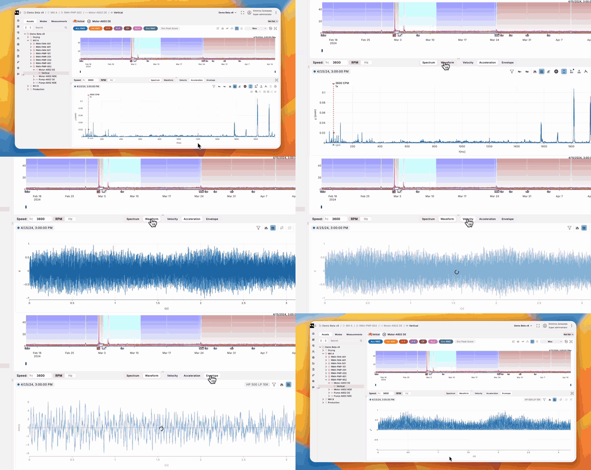
Velocity and envelope waveforms
See the time signal in the measurement you actually want. The plot-type control is now Spectrum or Waveform, each with Acceleration, Velocity and Envelope. Velocity reads in mm/s and envelope in g², and the band-pass or demodulation filter you already set carries straight over to the waveform.
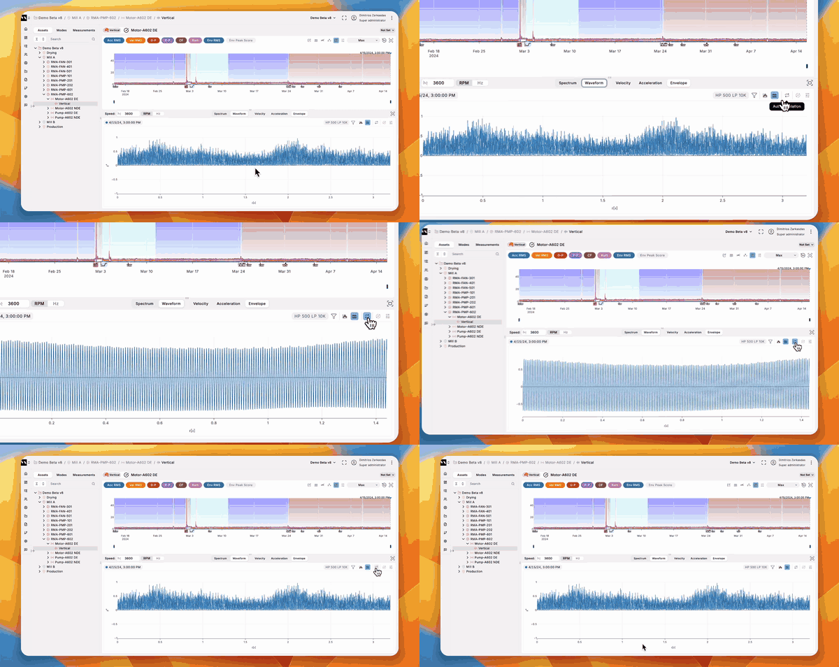
Autocorrelation on any waveform
Find the repeat in a signal that looks like noise. Toggle autocorrelation from the toolbar on the acceleration, velocity or envelope waveform. The plot shows lag in seconds, normalised to a peak of 1.0 at zero lag. Envelope autocorrelation is the one to reach for when you want a repeating bearing-defect period to stand out.
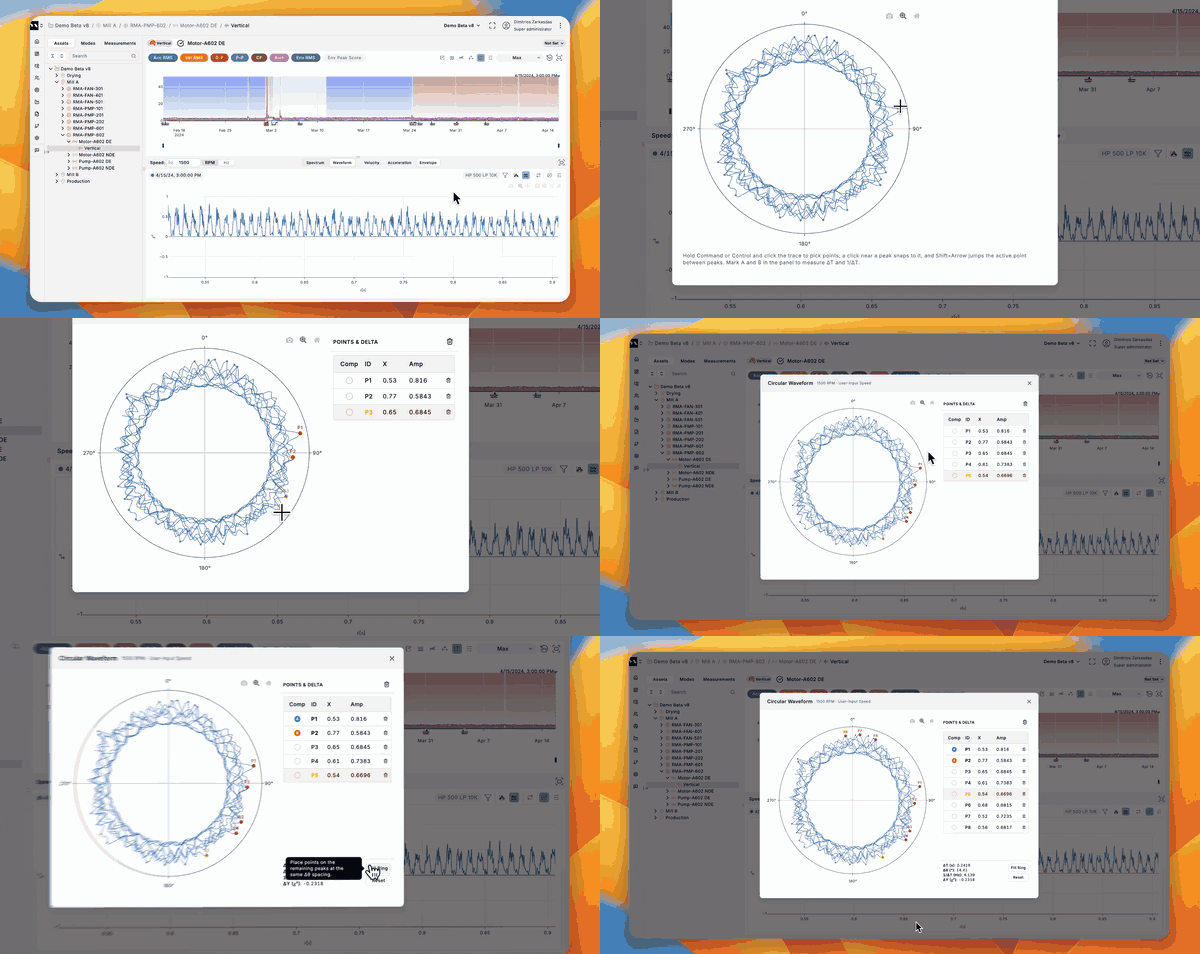
Circular waveform plot
Wrap the waveform around the shaft instead of stretching it along a timeline. Open it as a popup from any waveform view and every selected measurement is overlaid on one circle, each wrapped by its own speed and labelled with that speed in the legend. Place points to read the angle between events, and reorder which waveform is painted on top.
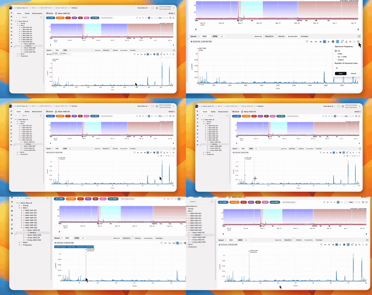
Spectrum x-axis in orders
Read the spectrum in shaft orders instead of hertz. Pick Orders in the x-axis unit selector and the gridlines land on 1x, 2x, 3x, computed as frequency ÷ running speed. The single and harmonic cursors show the order directly below the frequency, and the harmonic families list now shows each family's order beside its frequency.
A running speed you don't have to enter
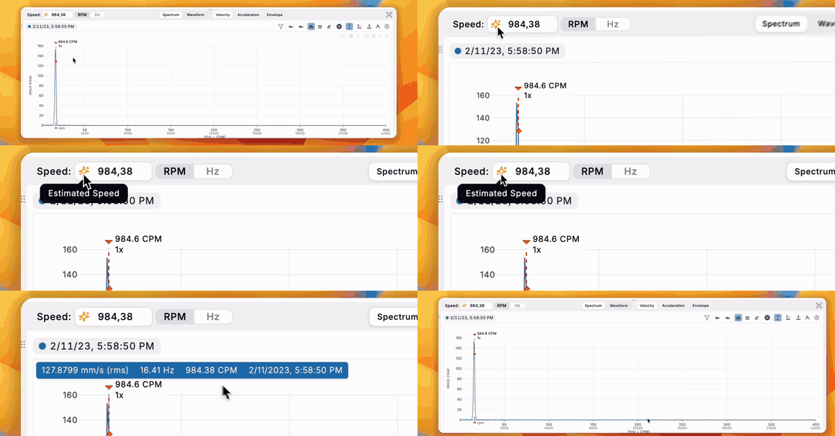
When a measurement has no sensor-measured speed, Multiviz now estimates rather than falling back to a fixed 60 Hz. It flags the estimate with an amber icon and shows it as ~N in the measurements table, and cursors start at that estimate's 1x until you click a real peak.
Finer control of every cursor
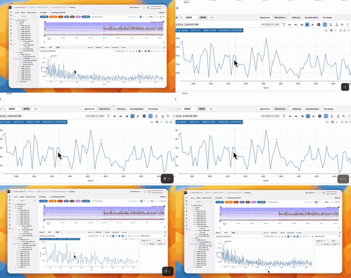
Move a cursor by a tenth of a bin. Hold Cmd or Ctrl with an arrow key for the fine step, plain arrows for the next point, and Shift+arrow to snap to the next peak. It works on the signal cursor, the harmonic cursor, sidebands and picked points. Grabbing any harmonic line now moves that line one bin at a time instead of jumping by its order, and pressing X cycles through the detected harmonic families.
Deselect a measurement in one click
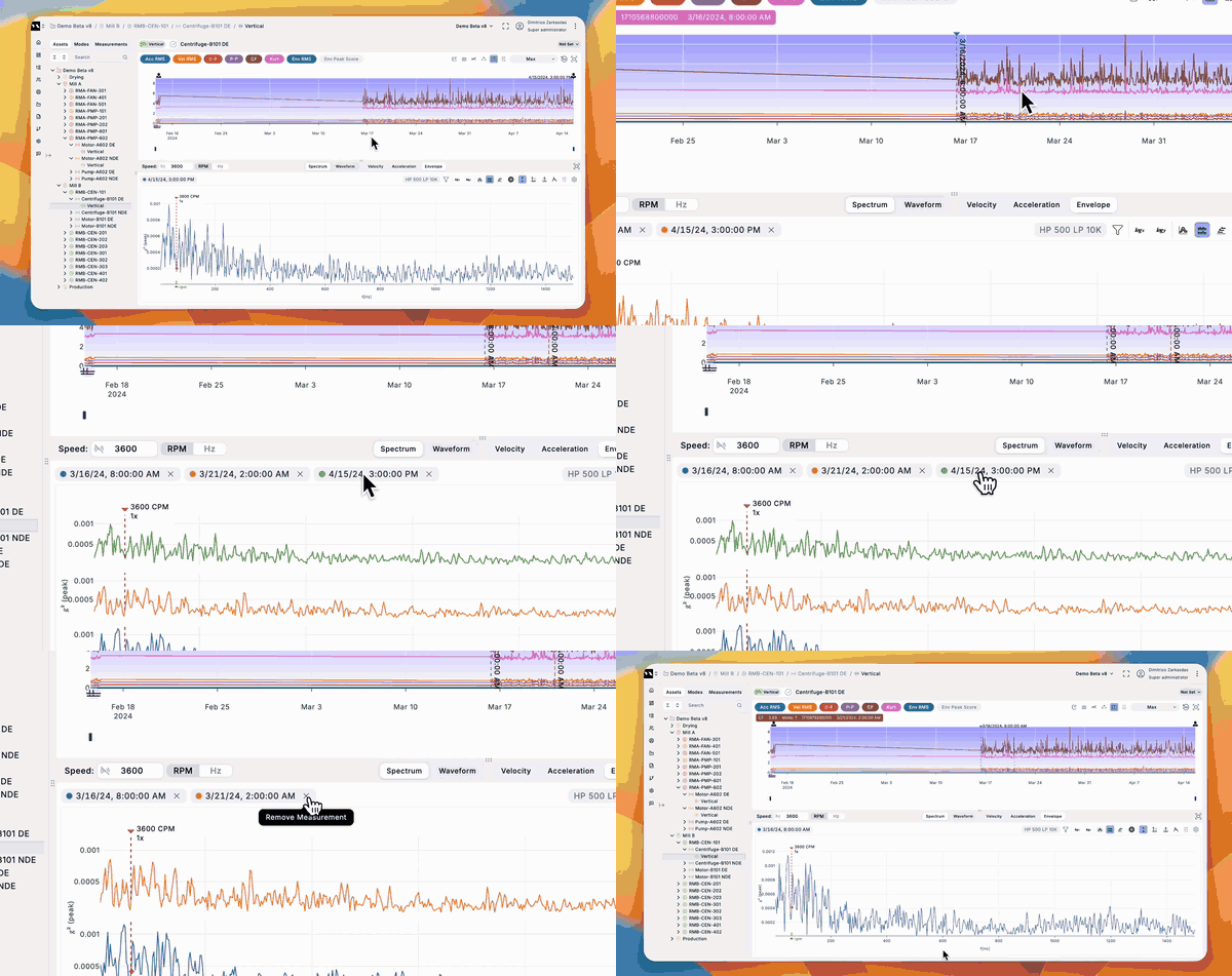
Take a measurement off the plot without going back to the table. Selected measurements appear as tags above the plot, each with a colour swatch matching its trace and an X to remove it.
Clear actions on the trend, with the full note
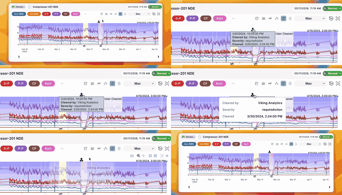
See where someone cleared a priority, right on the trend. Clear actions appear as a person icon above the KPI plot at the timestamp that was cleared. Click one and a popover shows the full clearing note along with who cleared it, the severity and when. Previously the note was only a hover tooltip, cut off at 20 characters.
KPI cursor readout out of the way
Read the trend without the tooltip sitting on top of it. Hover info on the KPI plot is now a single fixed row in the top-left corner, presented the same way as the spectrum plot's cursor bar, and it shows the trace's unit next to the value.
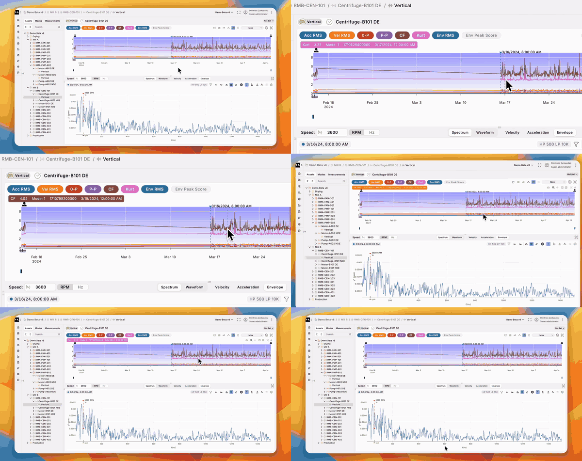
Frequency ranges down to 0.1 Hz
Configure spectra for slow-turning assets. The frequency-range floor in site configuration dropped from 2 Hz to 0.1 Hz across velocity, acceleration and envelope. Values below 2 Hz are still accepted, flagged with a reminder that readings can be unreliable depending on sensor mounting and frequency response.
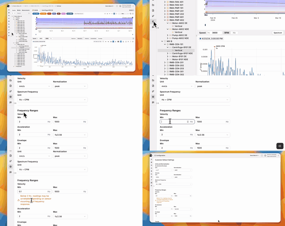
Start a new report from an existing one
Skip the retyping on a repeat report. Creating a summary report now defaults to starting from your most recent one, carrying over its areas, its per-machine findings and recommendations, and its cover text, while regenerating statuses and charts from current data. The name and cover date are entered fresh, and the report you started from is left untouched.
Behind the scenes
Most of July's engineering effort went into a new asset hierarchy. An ongoing migration reorganises a site's sensors into components and measuring points. We are doing this site by site, so nothing changes on your side until your site has been migrated, and everything above works the same either way.
This is the groundwork for Multiviz 3.0. The new hierarchy is what lets us give you a machine view built around the machine itself: its drive train laid out as a diagram, KPIs and findings per component rather than per sensor, and a machines overview with a task board alongside it. A rebuilt site overview and a new asset-tree navigation come with it. All of it needs a site to know its components before it can show them, which is what the migration is for. More on 3.0 as it gets closer.